Systran: Browser Extension Redesign
Modernising a lightweight tool for faster, smarter translation on the web
/Lightweight Design/
/Browser App UX/
/Lightweight Design/
/Browser App UX/
Systran's browser extension lets users instantly translate selected web content across languages. Though functionally reliable, the original extension had become outdated — visually inconsistent, difficult to use, and lacking the polish users expected from modern productivity tools.
As Product Designer, I led the complete UX/UI redesign of the extension, modernizing its interface, improving clarity and usability, and aligning it with Systran's evolving design standards.
Streamline and modernize the Systran browser extension to improve usability, visual clarity, and cross-platform consistency. As Product Designer, I owned the redesign process from concept to delivery — creating a lean, accessible, and brand-aligned experience that felt fast and intuitive.
5 weeks (redesign sprint)
Myself (Product Designer), 1 PM, 1 front-end engineer
The original extension suffered from visual clutter, unpredictable interaction patterns, and minimal feedback states. I began with a compact UX audit, identifying redundant UI elements, poor hierarchy, and lack of responsive design. Working with engineering and product, we prioritized a minimal, modular redesign that retained all core features while enhancing clarity.
The new layout emphasized simplicity: a single panel view, consistent padding, improved iconography, and clear text hierarchy. I introduced segmented control toggles for input/output language switching, loading indicators for translation requests, and empty states that explained how to get started.
The experience was optimized for quick, repeated use — whether users were translating a headline, a paragraph, or an entire page.
I built a complete interaction prototype in Figma, with separate views for each extension state: idle, translating, success, error, and fallback. Each element included component specs and interaction notes. The handoff process included developer sync sessions, QA review, and an async feedback loop via Jira.
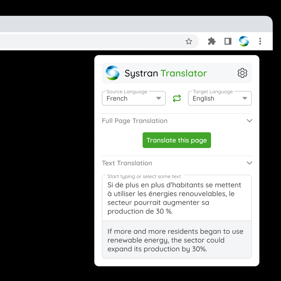
Within the extension’s pop-in, collapsible UI sections help users focus only on what they need, reducing visual clutter and allowing key actions to remain front and center.
A simple on/off switch that allows users to automatically translate full web pages without needing to manually trigger the action each time—ideal for users who work across multilingual websites regularly.
A separate settings page provides access to more advanced preferences and customization, keeping the main interface lightweight while still offering flexibility for power users.

Settings and account could be accessed through a dedicated page, lightening the extension UI
Increased user engagement across enterprise accounts with web-based translation needs
45% improvement in user ratings across the browser extension and Google add-ons, reflecting enhanced usability and performance post-redesign.
Optimized compatibility across both Chrome/Mozilla browser extensions and Google Workspace add-ons.
This project pushed me to focus on high-impact simplicity — where every pixel mattered and user trust had to be earned quickly. Key lessons:
Small tools need fast clarity, not feature sprawl. Constraints pushed the design to be lean, clean, and friction-free.
Even brief interactions benefit from explicit state cues — loading spinners, confirmations, and clear error messages build trust.
Designing the extension in line with the main platform helped reinforce brand unity, even in lightweight contexts.